
During an internal data visualization learning session, I had the opportunity to share some intriguing techniques I employ with containers in my Tableau dashboards. While some attendees were already familiar with my tricks, the suggestion arose that this could make for an engaging blog post. Whether this idea came from genuine enthusiasm or my trademark catchphrase (“hey, that’s cool – write a blog about it!”), let’s embark on this journey!
Understanding the Power of Containers
Before we delve into the exciting possibilities of containers, let’s establish why they’re essential for dashboard design. Firstly, containers bring order to the chaos of worksheets on your dashboard. They provide structure and consistency, ensuring that your dashboard’s elements maintain a unified size and layout. Secondly, in a world of varying screen sizes and devices, floating elements can become distorted. Containers offer a solution by anchoring dashboard elements in place, guaranteeing they look great, no matter how you view them.
Containers in Tableau come in two main flavors: Horizontal and Vertical. Think of them as layers in a hamburger (horizontal) or neatly arranged side by side (vertical). You can even nest containers within each other for advanced layout designs.
Getting Started with Containers
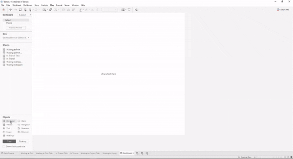
Let’s begin by exploring the basics of placing a worksheet inside a container. Imagine you want to insert two blank objects into a horizontal container. The clear indicators that your blank objects reside within the container are the bold blue outline around the parent container and the grayed-out interior. To select the parent container, simply double-click on one of the objects, and you’ll notice a dashed line separating the objects within.
Switching to a vertical container follows a similar pattern, as shown in the example below.
Once you’ve placed your objects inside containers, you gain fine-grained control over their sizes and attributes. For instance, within a horizontal container, you can individually size objects or opt for the “Distribute Contents Evenly” option from the parent container’s menu. Furthermore, you have the freedom to apply background colors to objects individually or to the entire container.
In the animated demonstration below, observe how I introduce a horizontal container in the midst of two objects already residing in a vertical container. Then, I adjust the horizontal container’s size and evenly distribute its contents.
Exploring Creative Uses of Containers
Now that we’ve established a solid foundation in containers, let’s dive into some inventive and practical examples of how to leverage them effectively in your Tableau dashboards.
Use Case #1: Title Underlines
Have you ever encountered dashboards where the title’s underline appears as a floating blank object with unpredictable positioning? I certainly have. In this use case, I’ll demonstrate how containers can be used to create that elusive underline.
- Begin by adding a vertical container.
- Drop in a blank object.
- Introduce a horizontal container on top of the vertical one.
- Place a text box into the horizontal container and input your desired text.
- Double-click the text box to select the parent container, then adjust its height.
Now that our text box resides within a horizontal container, we’ll utilize background colors to craft an underline effect.
- Click once on the text box and change its background to white.
- Double-click the text box to set its background to light grey, revealing a border.
- Return to the text box, right-click on Outer Padding, and select “0” for all sides to eliminate the border.
- Deselect “All sides equal” and add 2 pixels of padding to the bottom to create the underline. Adjust for the desired thickness.
- Fine-tune the title’s alignment by adjusting the Inner Padding (around 8-10 pixels).
- Right-click the text box, choose “Format text object,” and change the vertical alignment to “bottom” to keep the text aligned with the underline.
In essence, by placing just the text box in the horizontal container, we can manipulate colors and padding to craft an underline effect beneath the text.
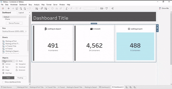
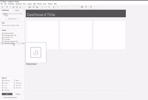
Use Case #2: Dashboard Sections
When constructing a dashboard, I prefer to begin by defining sections for future worksheets. Using horizontal containers with multiple vertical containers nested within them, I create a template that simplifies dashboard construction, particularly when employing sheet swapping.
Within an existing vertical container:
- Insert a horizontal container.
- Size the new horizontal container to your desired height (e.g., 300px in the example).
- Add a blank object first, followed by three vertical containers, then delete the blank object.
- Click on the down arrow and select “Distribute evenly.”
- Apply a white color to each vertical container.
- Adjust the Outer Padding to 10.
Once you’ve created the worksheets to be placed here, you can easily insert them into the vertical containers. Consider adding a text box or other worksheet as a title or header for each section. You’ll notice how seamlessly the worksheets fit into the existing containers, as depicted below.
Use Case #3: Side Bars
This use case is akin to creating underlines, but with an exciting twist involving left or right border padding. I’ll also show you a clever technique for adding a worksheet that changes colors according to corresponding metrics.
- Add a horizontal container to the vertical containers within your existing horizontal container.
- Drag one of the vertical containers into the new horizontal container.
- Adjust the padding to ensure the existing vertical containers have a padding of 0.
- Color the background of the parent horizontal container (the one you just dragged the vertical container into) with a dark gray.
- Modify the inner left padding of the parent horizontal container to be 8.
By using this method, we essentially switch which container we color to achieve our outline/underline effects. With the existing vertical container housing multiple objects, it’s more convenient to add the horizontal container as the parent container for color customization.
Now that we’ve learned how to add bars to our containers, let me demonstrate how to create a dynamic bar that changes based on metric fluctuations.
- Create a boolean calculation that returns true or false depending on whether the selected value meets a desired threshold.
- Create a worksheet that functions as a bar chart occupying the entire space – you can experiment with axis and SUM(1) calculations in the columns and rows to achieve this.
- Color the bar chart using the true/false calculation created in Step 1.
- Drop a new horizontal container into the existing parent horizontal container and add other containers that will complement this changing color bar.
- Adjust the width of the color bar to 8 pixels.
- Fine-tune the outer padding of the parent container to 10.
With this technique, you can create metric indicators that also contribute to the design and alignment of your dashboard.
In Conclusion
I incorporate containers into nearly every dashboard I build because they play a crucial role in maintaining organization and alignment. Users accessing the dashboard through various devices can rest easy knowing that the layout remains consistent. I hope these tricks were not only helpful but also provided you with insights into various use cases for containers.
Enjoy experimenting with containers in Tableau, and remember, there’s no need to contain your excitement!